Get In Touch
hello@laviastudio@gmail.com
Vancouver, BC
Elevate your brand presence while extending your creative runway

Vancouver Currency Exchange

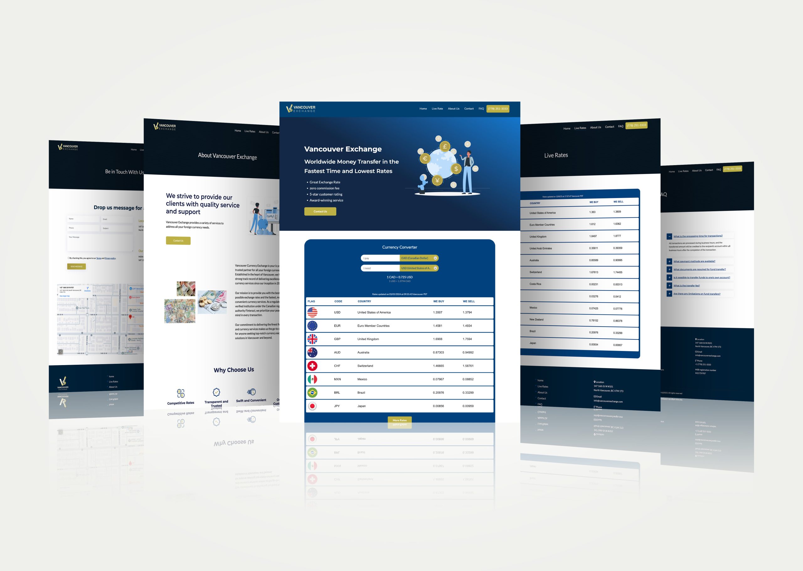
A modern, responsive WordPress redesign for a Vancouver-based currency exchange — featuring live rates, a real-time converter, and a streamlined user experience.

  • Client

    Vancouver Currency Exchange

  • Role

    UX/UI Designer, WordPress Developer

  • Date

    January 2024

  • Live Website

    https://vancouverexchange.ca/

Open Project

Client Context

Vancouver Exchange is a trusted currency exchange service based in the heart of Vancouver.
While the business had a functioning website, it lacked modern design, clear service communication, and essential features such as live currency rates and a currency converter.
These missing elements were critical for customer trust and convenience, especially in the competitive foreign exchange market.

The Challenges

  • Outdated, non-responsive design that didn’t reflect the professionalism of the brand.

  • No live exchange rate display or currency conversion tool, which made it harder for customers to get real-time information.

  • Lack of clear calls-to-action and structured service presentation.

  • Weak local SEO performance, limiting discoverability in the Vancouver market.

My Role

  • Full-scope UI/UX design and custom WordPress development, including:

    • UX research & wireframing

    • Visual design aligned with financial credibility and trustworthiness

    • Development of live rates integration & currency converter

    • SEO and mobile optimization

    • Performance and security enhancements

The Solution

I designed and developed a clean, professional, and fully responsive website that puts real-time financial information at the center.
The homepage now features live exchange rates and a currency conversion tool—two critical features that dramatically improve the user experience.
The site layout was restructured for clarity, with a focus on intuitive navigation, strong brand presentation, and quick access to contact/location details.

The Process

  1. Discovery & Research – Identified user needs, competitor standards, and financial UX best practices.

  2. Wireframing & UX Planning – Mapped out user journeys to prioritize quick access to rates, converter, and contact info.

  3. Visual Design – Created a professional, trust-driven aesthetic using clean typography, balanced spacing, and a color palette that conveys stability and credibility.

  4. Custom Development – Integrated live exchange rate feed and built a real-time currency converter.

  5. SEO & Optimization – Implemented local SEO strategies and ensured lightning-fast load times across devices.

Key Features Delivered

Live Exchange Rates – Real-time updates for major currencies.

Currency Converter – Instant calculation tool for on-site users.

Responsive Design – Seamless experience across mobile, tablet, and desktop.

Local SEO Optimization – Targeted keywords and structure for higher Google ranking in Vancouver.

Optimized Performance – Fast load times and secure infrastructure.

Vancouver-Currency-Exchange-–-Home-08-13-2025_05_43_PM

Impact

The redesign has transformed Vancouver Exchange’s online presence from a static informational site to a dynamic, conversion-driven platform.
Customers can now check rates instantly, calculate conversions in real time, and easily find business contact details—leading to stronger engagement and improved trust.

Color palette

Primary
#082036
SCSS var
$color-blue

R 8
G 32
B 54
  

Midnight Navy

Beige
#bcb157
SCSS var
$color-golden

R 188
G 177
B 87
  

Golden Olive

White
#FAFAFA
SCSS var
$color-Ivory Sand

R 250
G 250
B 250
  

Ivory Sand

Blue
#17427a
SCSS var
$color-blue

R 23
G 66
B 122
  

Royal Blue

A professional and trustworthy look was achieved through deep navy and royal blue, paired with a warm golden olive to reflect value and prosperity. Soft ivory sand adds clarity and approachability, balancing the bold tones for a modern, welcoming financial brand.

Typography

Headings use Montserrat, a geometric sans-serif with clean lines that conveys modernity, clarity, and professionalism—ideal for building trust in a financial service. Body text is set in Lato, a humanist sans-serif chosen for its warmth and high readability, ensuring the content feels approachable while remaining easy to scan on all devices. Together, the pairing balances authority with friendliness, supporting the brand’s goal of being both dependable and customer-focused.

Headline 1

H1: Montserrat, Bold, 35 pt

Headline 2

H2: Montserat, Bold, 33 pt

Headline 3

H3: Montserrat, Bold, 20 pt

Body text

P: Lato, Regular, 18 pt

Let's get in touch,
we respond fast.

Ready to work together?
Back

This website stores cookies on your computer. Cookie Policy